Design: A “10 Year Challenge” for D&AD’s Identity

The 10 Year Challenge that has swept the internet can get silly at times, but it also gives us an opportunity to show how a brand’s identity evolves.

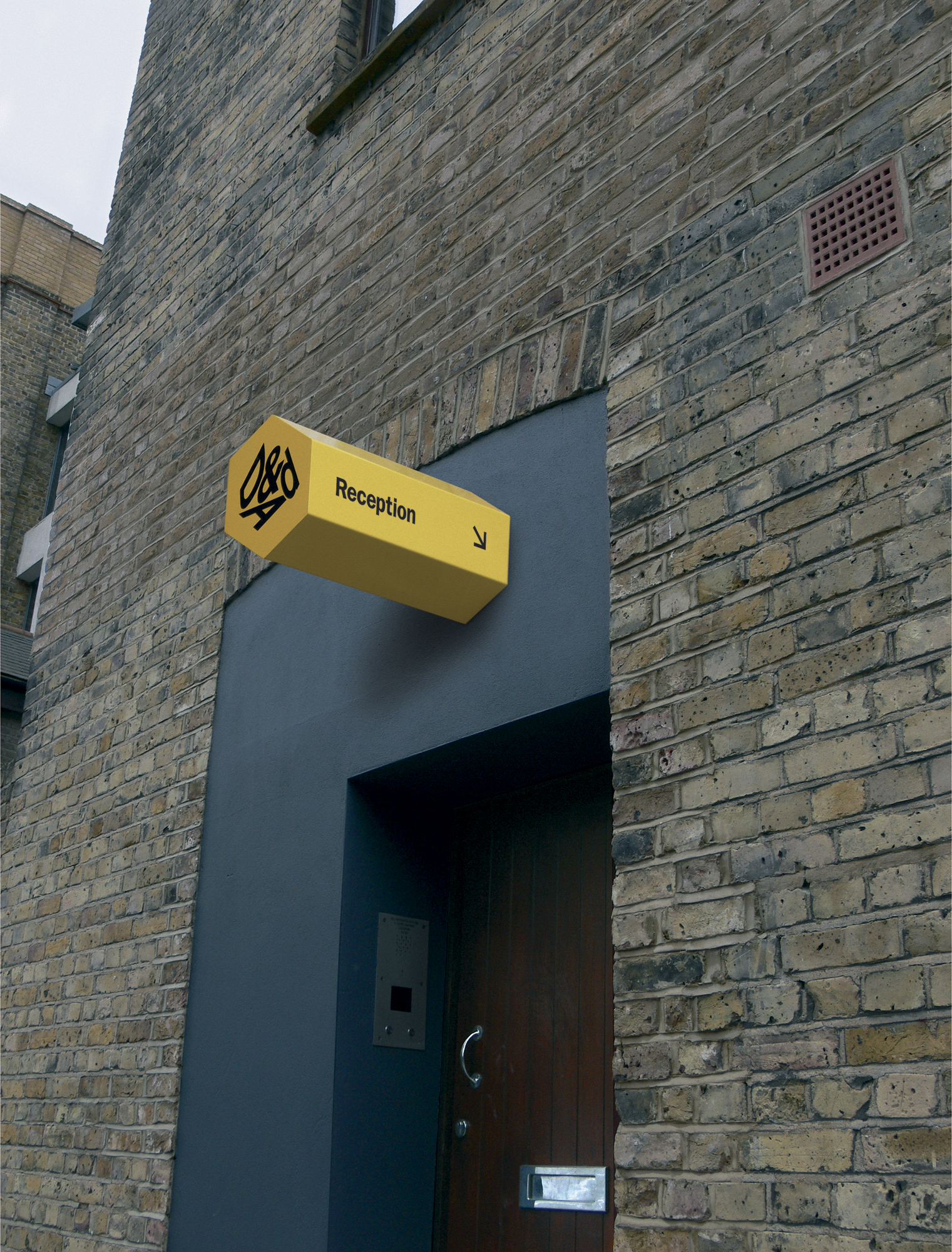
Recently, design firm Turner Duckworth won Gold in Design Annual 2019 for their “D&AD Signage” (ABOVE). It incorporates Design and Art Direction’s logo splashed across the windows and the front of the building. This perspective-shifting design draws in passersby and perhaps represents how designers look at their work from various angles. They also threaded D&AD’s bold yellow color and various hexagonal elements throughout the interior of the building. 

Going back 10 years, in keeping with the internet craze, we look to Rose Agency’s brand identity for D&AD from Design Annual 2009. Also a Gold winner, this D&AD Identity (ABOVE) created a sign that appeared to be a pencil inserted into the side of the building. This ties into the pencil-shaped awards that correspond to the competition they’ve held for 57 years. Rose also designed actual pencils that served as business cards for the company’s employees, customized with names and phone numbers on their iconic yellow paint.
With such a strong start in 2009, the 10 Year Challenge proves how a brand identity was successfully maintained and built upon by teams of talented designers.

Submit to the Design Annual 2020 competition by March 13, 2018. Winners will have the opportunity to see their work published on our website, blog, newsletter, and social media platforms!

Author: Graphis

Leave a Reply

Your email address will not be published. Required fields are marked *